
Smooth Sliding Image Caption With CSS3
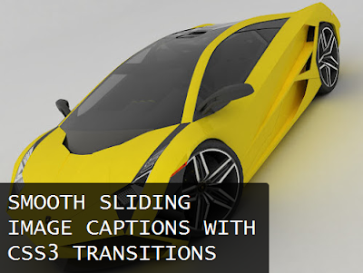
Check out this pretty neat new design of an image caption from Bhavesh Pamecha! It’s a caption that slides out at the bottom of the image only when the user moves his mouse cursor over anywhere near a small question mark located at the bottom of the image, this is to minimize distraction, explains Pamecha.
So far, the effect works without a problem with the latest version of Chrome, FireFox, and Opera but not with Internet Explorer. It hasn’t been tested on Safari yet.
So how do you install it to your blog? Follow the steps below.
- In your dashboard, under the Design page, go to Template and click on “Edit HTML” then “Proceed”.
- Click to check the “Expand Widget Templates” box.
- Using Ctrl+F, look for ]]</b:skin>
- Copy and then paste the follow code below before it:
.capblock {
 display: block;
 position: relative;
 overflow: hidden;
 margin: 0 20px 20px 0;
}

.capblock a {
 color: #fff;
 text-decoration: none;
}

.capblock a:hover {
 color: #ccc;
 text-decoration: none;
}

.tbicap {
 position: absolute;
 color: #fff;
 text-decoration: none;
 background: #000;
 background: rgba(0,0,0,0.75);
 padding: 10px 10px;
 bottom: 5px;
 left: -10%;
 max-width: 400px;
 overflow: hidden;
 opacity: 0;
 -webkit-transition: all 0.6s ease;
 -moz-transition: all 0.6s ease;
 -ms-transition: all 0.6s ease;
 -o-transition: all 0.6s ease;
 -webkit-border-radius: 0px 5px 0px 0px;
 border-radius: 0px 5px 0px 0px;
}

.tbicap:hover {
 left: 0;
 opacity: 1;
}

.capblock:before {
 content: "?";
 position: absolute;
 font-weight: 800;
 background: #000;
 background: rgba(255,255,255,0.75);
 text-shadow: 0 0 5px #fff;
 color: #000;
 width: 24px;
 height: 24px;
 bottom: 10px;
 left: 10px;
 -webkit-border-radius: 12px;
 -moz-border-radius: 12px;
 border-radius: 12px;
 text-align: center;
 font-size: 14px;
 line-height: 24px;
 -moz-transition: all 0.6s ease;
 opacity: 0.75;
}

.capblock:hover:before {
 opacity: 0;
}
NOTE: If the caption’s not displaying properly, try adjusting bottom: 5px; and if you’re using larger images then adjust max-width: 400px;
- Save the template.
To use the new sliding caption on an image in your post, just make sure that you’re in HTML mode as you enclose your image inside tags with the proper attributes as shown in the example below:
<div>
<a href="IMAGE LINK HERE" target="_blank"><img alt="" src="IMAGE URL HERE"/></a>
<div>
<span><a href="POST LINK HERE">CAPTION HERE</a></span></div>
</div>
Remember to replace all the necessary values with that of your own. Also, you can remove the <a href=”POST LINK HERE“> and </a> if you just want the caption without the link to render it unclickable.
Hope you guys enjoy this featured Blogger trick of the day. Cheers!


0 comments